Kalkhoff Bikes
Lead UX/UI Designer
Bravoure
2026
Kalkhoff’s extensive range of product lines, levels and model variations had become difficult for customers to understand. The website presented the range as a catalogue, leaving people to decode unfamiliar names, specifications and configuration options for themselves.
In 2026, I led the redesign of Kalkhoff’s product discovery experience. I facilitated stakeholder workshops, created and tested prototypes, made the core UX decisions and translated the chosen direction into the final design.
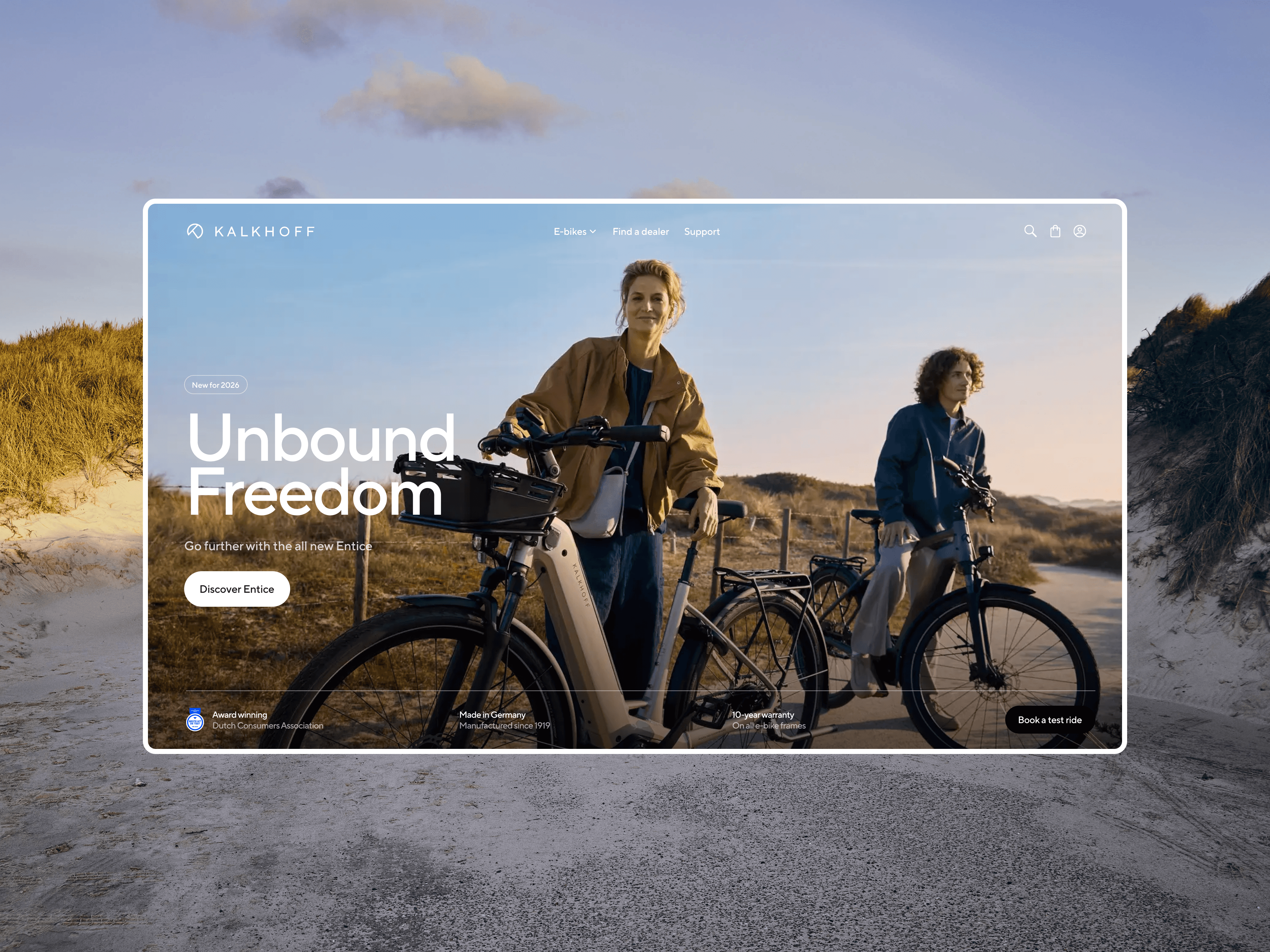
Customers had to decode the range for themselves
The problem was not a lack of information. It was the order in which that information appeared. Customers entered a large catalogue of similar bikes, then relied on technical filters to decide what suited them - before the website had explained the product lines, equipment levels or meaningful differences between models.


The old experience offered limited guidance through the product range.
Range complexity
Across product lines, levels and model variations, similar names made the relationships between bikes difficult to understand. Customers encountered the full complexity of Kalkhoff’s range before the website had explained how it was structured.

Client workshop
I hosted a workshop with Kalkhoff to map the existing journey, identify where customers lost confidence and align on the opportunities for improvement.


Exploring how guidance
could replace filtering
I explored different ways to introduce the range progressively: first helping customers understand a product line, then its equipment levels, and finally the models available within each level.
Interactive prototypes allowed the client team to experience each direction rather than judge isolated screens. Feedback from internal testing at Kalkhoff helped us identify the concept that best balanced guidance, comparison and freedom to move through the range.

The prototypes were tested internally with the Kalkhoff team at its headquarters. Their feedback exposed where the hierarchy still felt unclear and helped me refine the strongest direction before moving into final design.
Internal feedback helped refine the hierarchy and strengthen the final direction.
The final direction changed the sequence of the experience. Instead of dropping customers into a grid of similar products, it introduced the range in layers: product line, equipment level, model and configuration.
Each step answered a different question, while comparison and backtracking remained available throughout. Customers could learn enough to make a decision without losing the freedom to explore.

The new journey reveals complexity gradually, helping customers understand the range before choosing a specific bike.
Making the differences between
bikes easier to understand
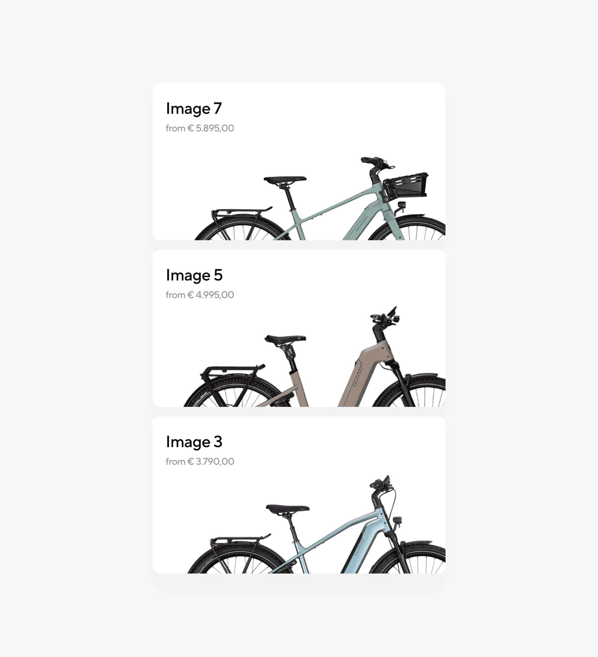
Model names and specifications only become useful when customers can understand what changes between them. I designed the level and model pages around meaningful differences, combining plain-language benefits with direct comparison.
Customers can move between levels, compare models within a level and see which features justify each step up—without returning to a generic product grid.


Bringing configuration into the decision
Configuration had previously been easy to miss or understand too late. The redesigned product experience makes colour, frame size, battery and accessories visible as part of the decision—not as technical details hidden at the end.
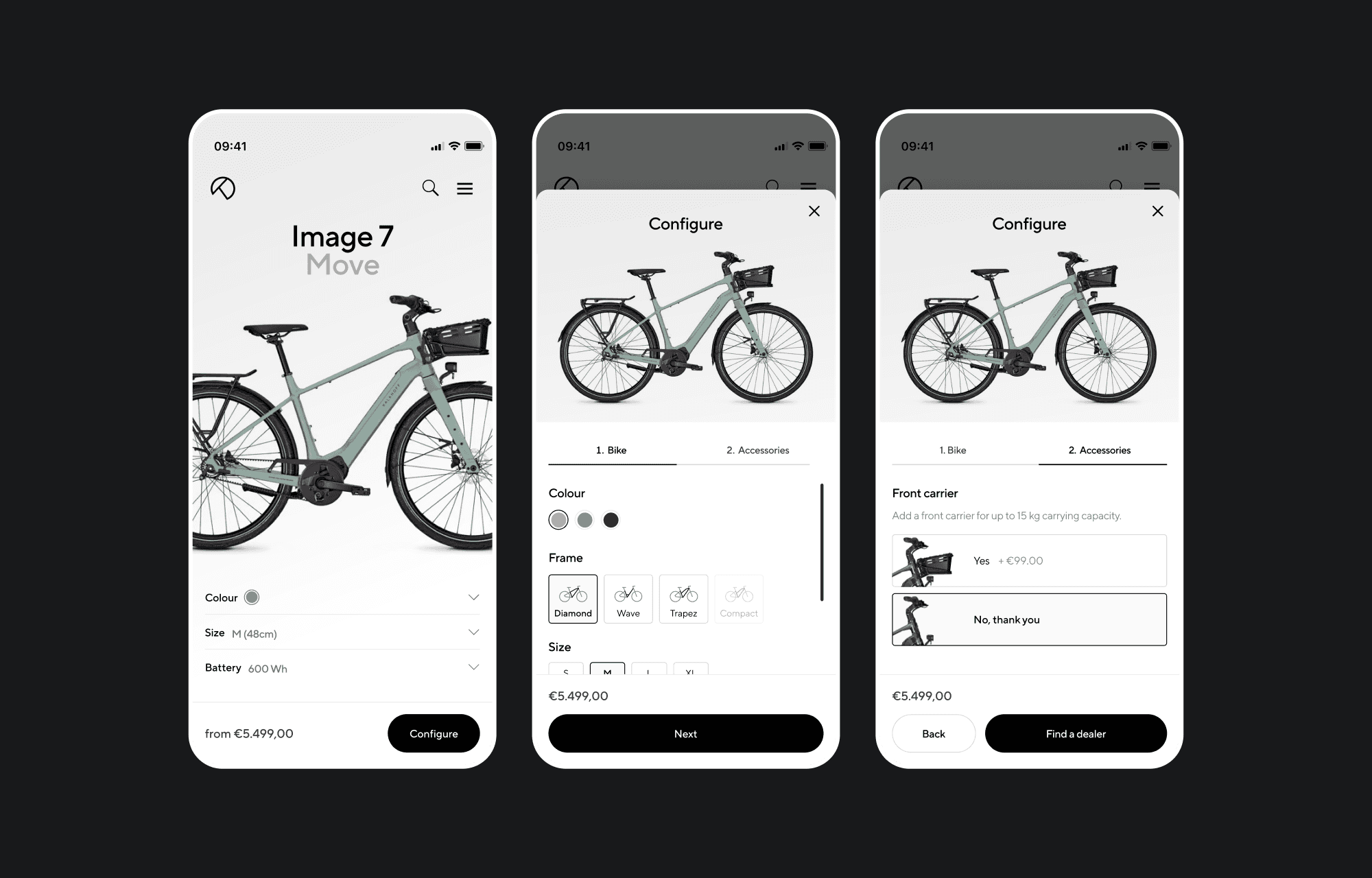
Configuration options are introduced progressively, keeping the product page clear until customers choose to explore them.
A clear direction, ready for development
The final direction was well received by Kalkhoff and aligned stakeholders around a clearer way to present the range. The designs are now in development with parent company PON’s in-house team.
