Oxfam Novib
Lead UX/UI Designer
Bravoure
2025
Oxfam Novib works on some of the world’s most urgent and complex issues. But its digital platform made those issues feel vague, distant and difficult to act on. They needed an experience that could turn awareness into meaningful support - from signing a petition to making a donation.
Working closely with the Oxfam team, I led the UX/UI design execution at Bravoure and translated the strategy into a clearer, more conversion-focused experience, redesigning the whole platform including donations, petitions and the webshop.


Important stories were getting lost
The existing website held a huge amount of valuable information, but it relied on visitors to find their own reason to care. Campaigns were text-heavy, journeys felt fragmented and the route from understanding an issue to supporting it was not always clear.


The old experience was rich in information, but the path from awareness to action was unclear.
Big issues felt too distant
The strategic shift was to stop treating inequality as one abstract subject. By making each issue smaller, more specific and more immediate, the platform could build personal relevance before asking anyone to act.

Focused campaign microsites
We explored a new model: social-first microsites built around one urgent topic and one meaningful action. Early prototypes tested how editorial storytelling, emotion and conversion could work together without turning every page into a generic donation funnel.


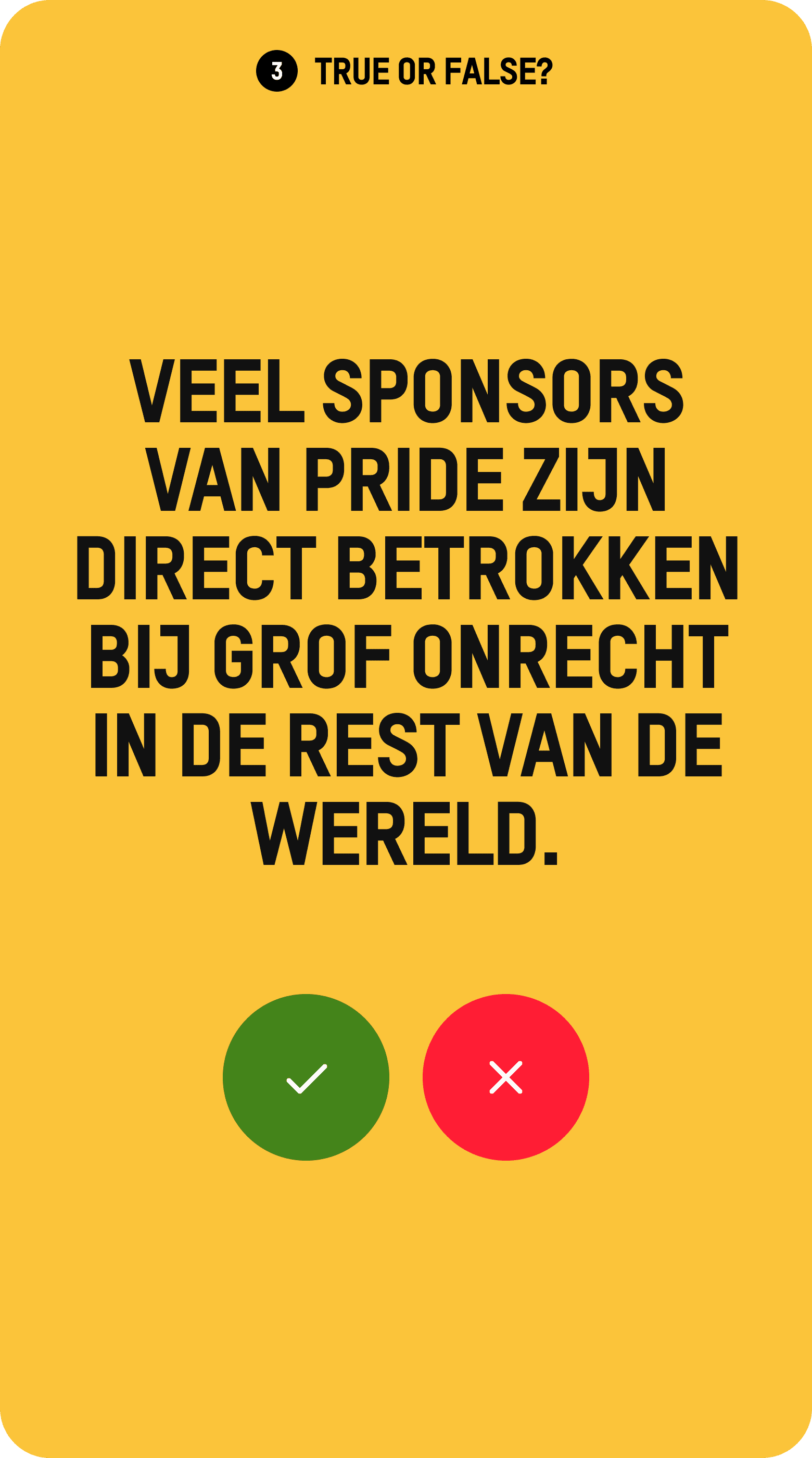

Social-first storytelling and conversion could live in the same experience.
One urgent story. One clear action.
Each microsite was designed as a focused journey rather than another content page. A strong human story creates attention, the page builds relevance and urgency, and a clear action becomes the natural conclusion - not a disconnected button at the end.


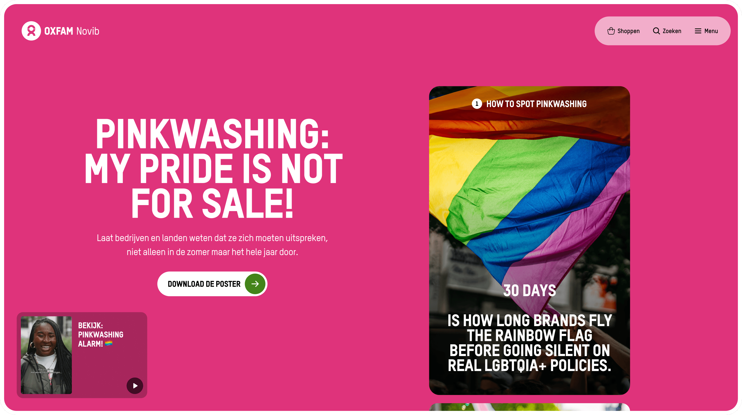
Different causes can tell different stories without rebuilding the experience from scratch.
Making donating easier
The same principle shaped the donation experience: make the impact of support clear, remove avoidable friction and keep the journey focused. Instead of separating persuasion from payment, the design carries context and confidence through to completion.


Lowering the barrier to support
Petitions create a lower-friction way to participate. The redesigned journey makes the action immediate, gives the moment of completion more meaning and creates a natural next step for continued support.


The broader redesign applied the same clarity across the platform, including the webshop. Every touchpoint needed to feel part of one Oxfam experience rather than a collection of separate destinations.


Different causes can tell different stories without rebuilding the experience from scratch.
A platform built to keep evolving
The MVP launched in October 2025, but the work did not stop there. The platform continues to evolve as new campaigns, journeys and content needs emerge. What began as a redesign became a foundation Oxfam Novib can keep using to turn complex issues into clear opportunities to act.
For me, the project showed that conversion design does not have to flatten a story. When content, emotion and interaction are designed together, the action can feel like the inevitable next step.
